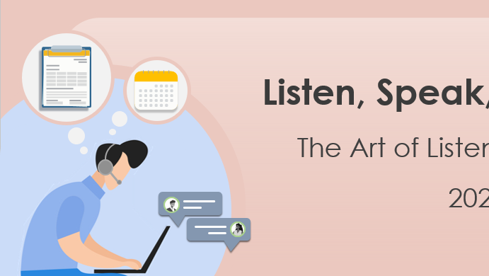
The CRA Orientation Experience mobile application was an onboarding app for new or potential employees to help them familiarize with the CRA structure and to provide useful information and guidance on the organisation.
My main responsibilities included developing UI (User interface) and graphical elements for the application, which included Booth designs, interactive elements and avatars that reflected cultural and ethnic diversity. As part of the process, I was also involved with planning and executing user testing sessions with a group of participants who went through each section of the app, to evaluate the performance and functionality of the product.
My main responsibilities included developing UI (User interface) and graphical elements for the application, which included Booth designs, interactive elements and avatars that reflected cultural and ethnic diversity. As part of the process, I was also involved with planning and executing user testing sessions with a group of participants who went through each section of the app, to evaluate the performance and functionality of the product.
Tools: Adobe Illustrator, Adobe Photoshop, Procreate
Booth Design
Frontal view of the Information Booth
Perspective
Determining the perspective of the frontal view of the booth was important in ensuring that the user was looking down onto the booth so all the contents on the table were clearly visible for the user to interact with.
Objects
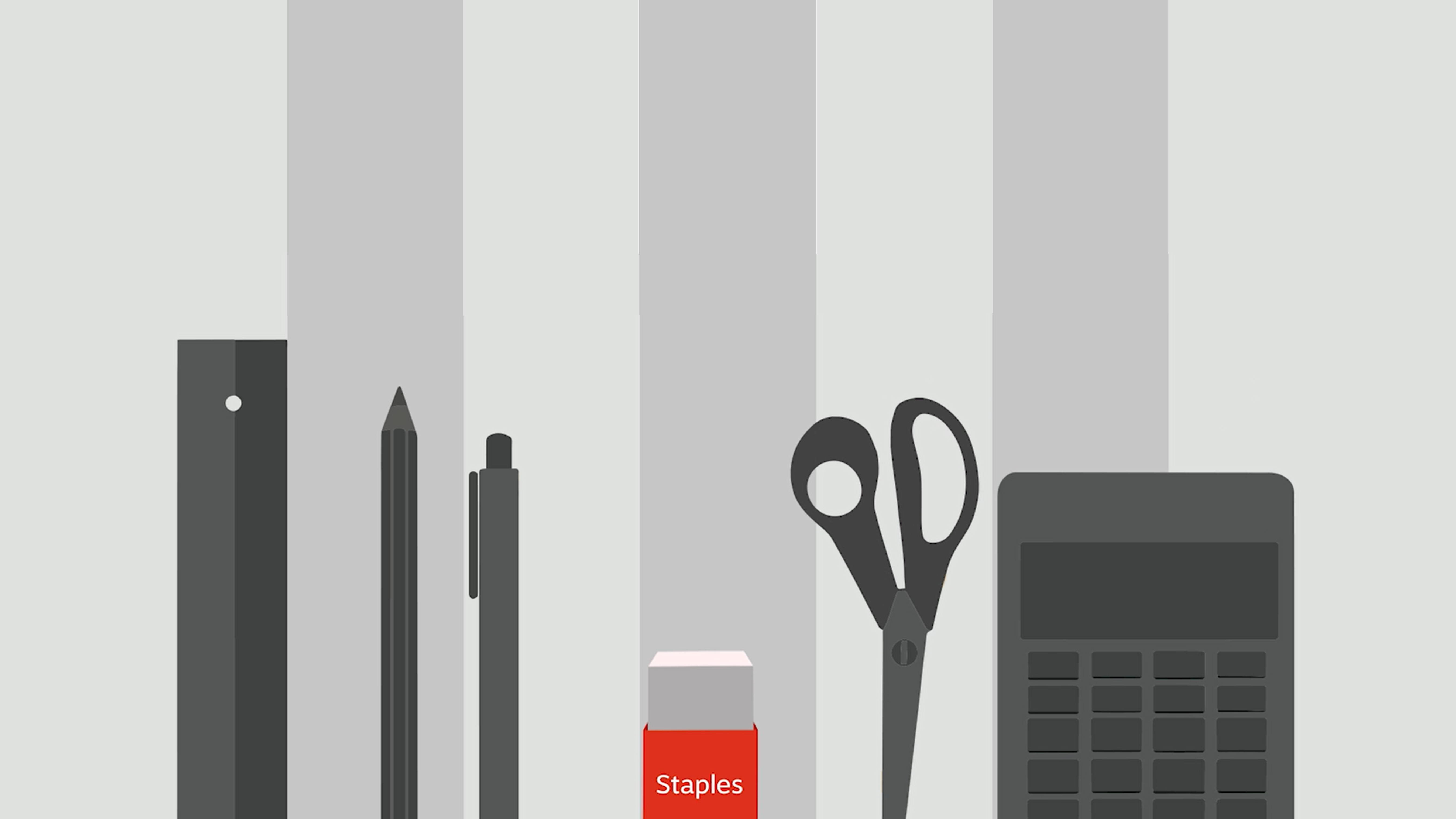
A lot of attention was given to the type of objects that were placed on the table of the booth, for both interactive and decorative purposes. In the case of the information booth (Image on the right) we placed informational pamphlets in the center. Periodically, the pamphlets would wiggle slightly to prompt the user to go through its contents.
Table
The tables and the overall booth designs had to have the branding of the department/network that it was representing. Since the Information booth was the first booth the user had to interact with, it followed the branding of the app, with the app logo used as the backdrop.
Frontal view of the Performance booth
Given that the app was being developed during the Covid-19 pandemic, we incorporated elements to make it more relatable and relevant to users' experiences during that time.
Avatars

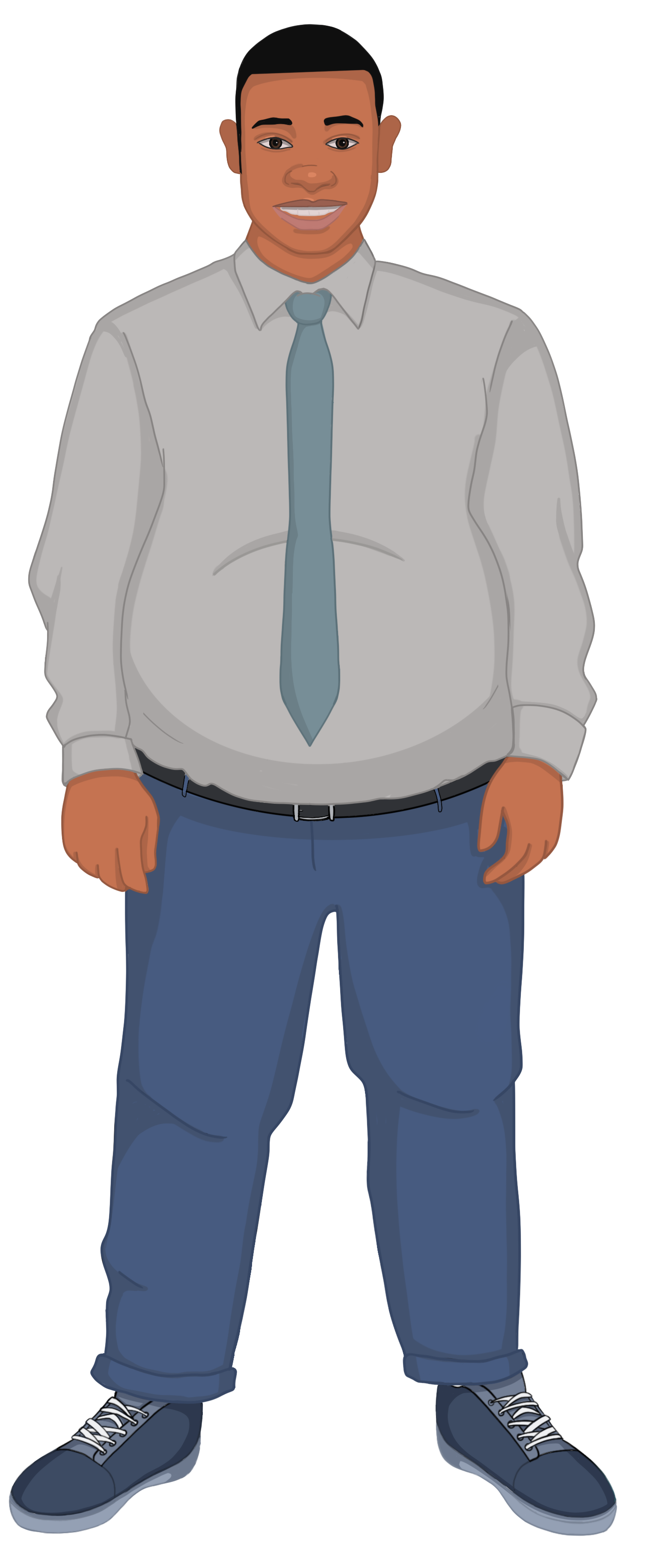
I designed avatars reflecting a wide range of cultural and ethnic diversity to symbolize the organization and its networks.
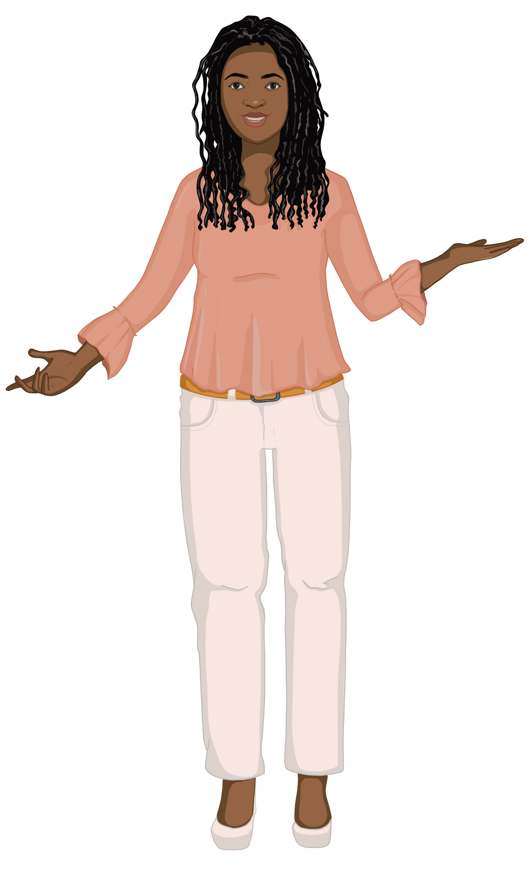

Diverse avatars help individuals from various cultural and ethnic backgrounds see themselves reflected in the organization. This promotes a more inclusive environment and demonstrates that the organization values diversity.
Incorporating diversity in visual representations is a simple yet powerful way to communicate that the organization is a welcoming space for everyone
Interactive assets
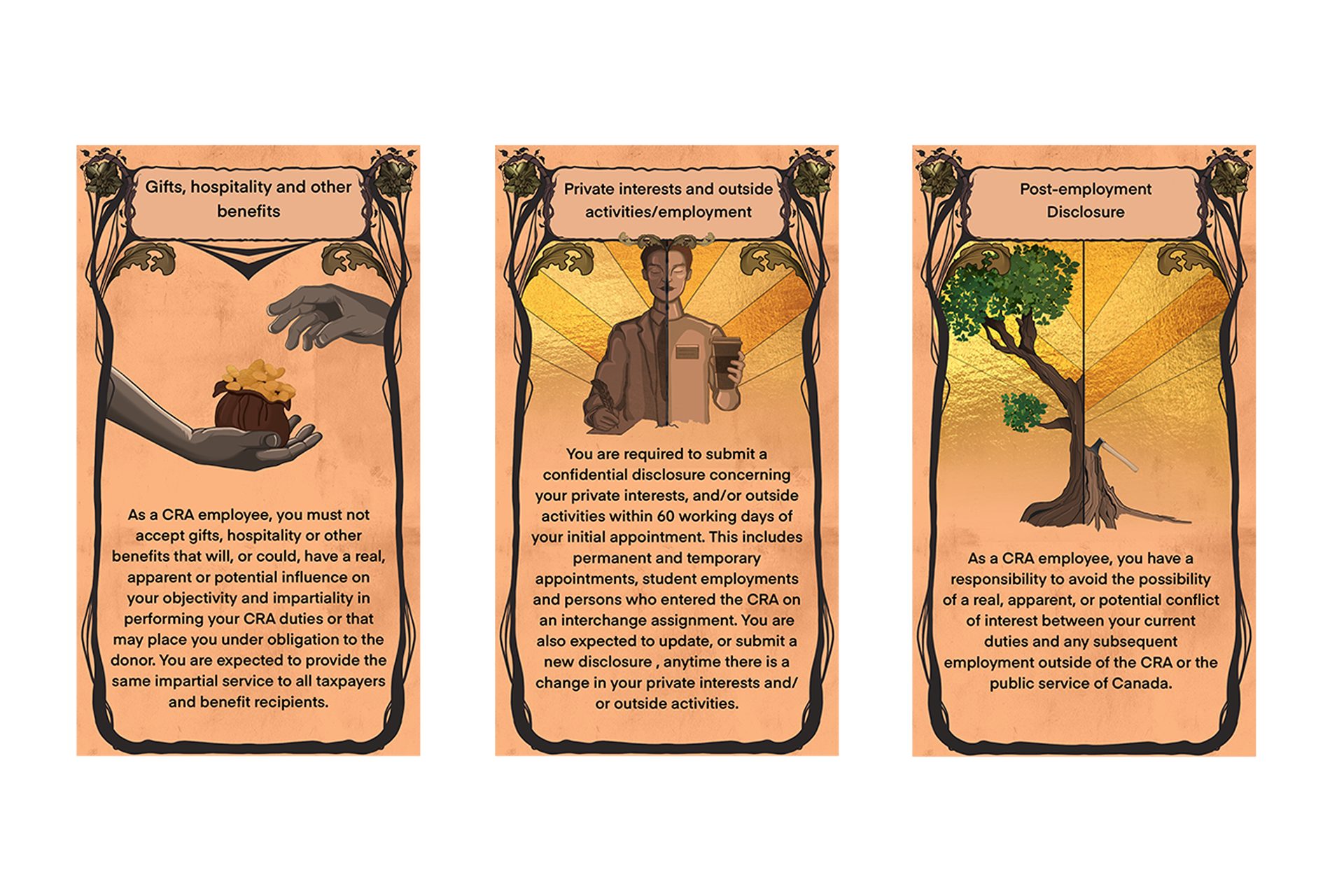
Information Cards
For the Integrity Booth, I created and illustrated interactive informational cards inspired by the design and style of Tarot cards.
Posters
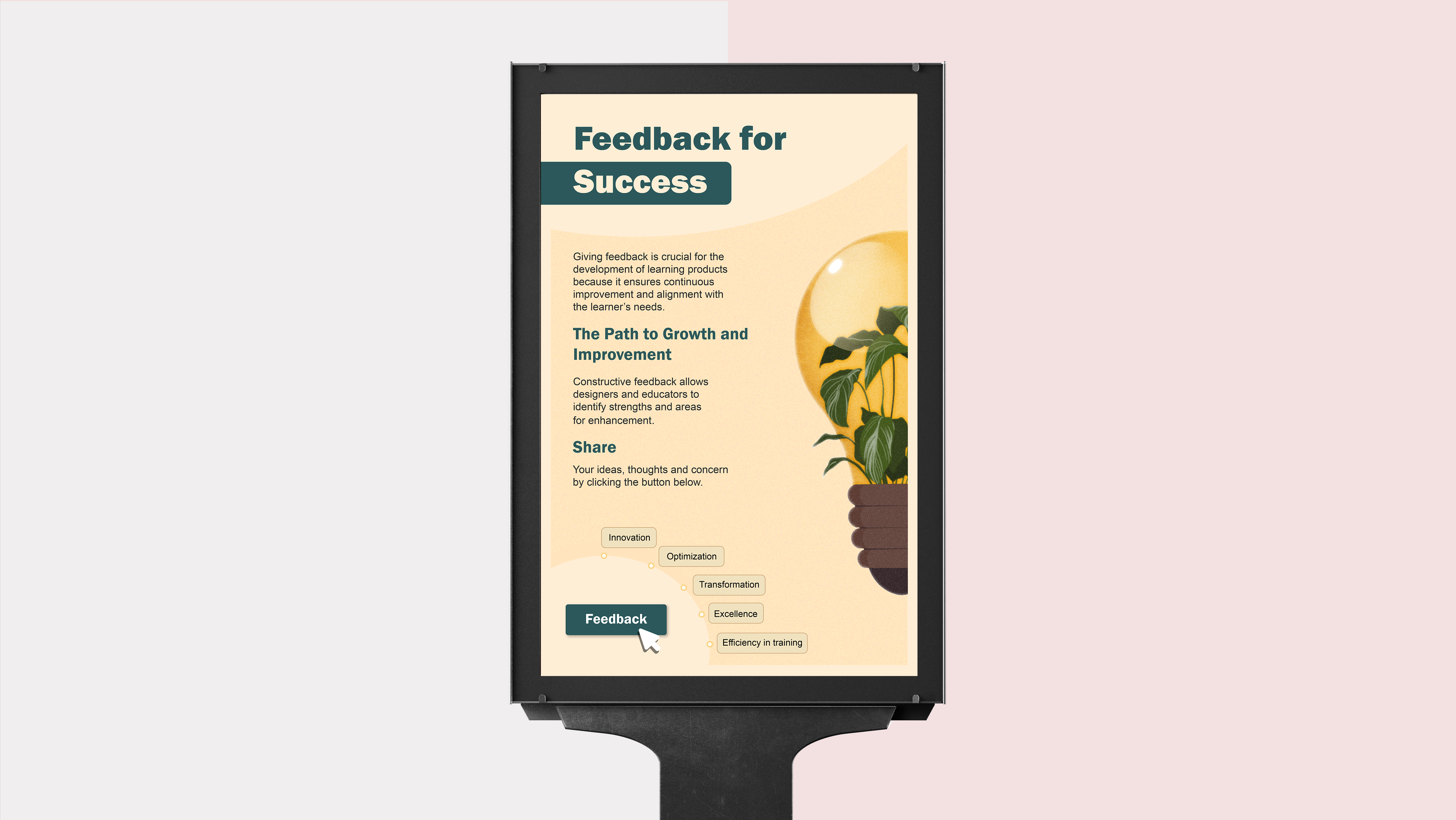
I also designed the positive space poster which was one of the interactive assets for the Pride Network booth.
